WCS Vibrant Oceans Baseline Coral Reef Monitoring
Source:vignettes/articles/vo_baseline_monitoring.Rmd
vo_baseline_monitoring.RmdThis case study follows an analysis of baseline coral reef studies
for Vibrant Oceans, completed by the Wildlife Conservation Society
(WCS). The original survey and analysis covered 168 sites across
Tanzania, Fiji, and Indonesia, surveying underwater information across a
diversity of management, habitat types, and other environmental
characteristics. This analysis is a small subset, only using publicly
available data, and intended to illustrate the usage of
mermaidr for such a project.
First, we load mermaidr and search for projects tagged
with “Vibrant Oceans”:
library(mermaidr)
vo_projects <- mermaid_search_projects(tags = "Vibrant Oceans")
vo_projects
#> # A tibble: 18 × 21
#> id name countries num_sites num_active_sample_un…¹ num_sample_units tags
#> <chr> <chr> <chr> <int> <int> <dbl> <chr>
#> 1 95e0… 2019… Fiji 44 0 406 WCS …
#> 2 b24c… 2022… Fiji 67 0 307 WCS …
#> 3 2f6d… 2022… Fiji 11 0 105 WCS …
#> 4 1e98… Aceh… Indonesia 12 3636 144 WCS …
#> 5 60c7… ACEH… Indonesia 9 0 108 WCS …
#> 6 3a9e… Aceh… Indonesia 18 6 198 WCS …
#> 7 ea85… Aceh… Indonesia 18 37 6 Vibr…
#> 8 207e… Aceh… Indonesia 36 3 540 WCS …
#> 9 e964… BAF … Kenya, T… 15 0 55 WCS …
#> 10 507d… Kari… Indonesia 43 8 842 WCS …
#> 11 b2d1… Pula… Indonesia 22 1 252 WCS …
#> 12 0a08… Pula… Indonesia 22 2 278 WCS …
#> 13 1277… Taka… Indonesia 46 1 540 WCS …
#> 14 bcb1… Taka… Indonesia 39 1 702 WCS …
#> 15 c314… Taka… Indonesia 39 0 702 Vibr…
#> 16 ac58… Taka… Indonesia 39 0 703 WCS …
#> 17 a93b… VOI … Tanzania 25 0 164 WCS …
#> 18 a352… VOI … Tanzania 25 2 118 WCS …
#> # ℹ abbreviated name: ¹num_active_sample_units
#> # ℹ 14 more variables: project_admins <chr>, suggested_citation <chr>,
#> # bbox <df[,4]>, notes <chr>, status <chr>, data_policy_beltfish <chr>,
#> # data_policy_benthiclit <chr>, data_policy_benthicpit <chr>,
#> # data_policy_benthicpqt <chr>, data_policy_habitatcomplexity <chr>,
#> # data_policy_bleachingqc <chr>, data_policy_macroinvertebrate <chr>,
#> # created_on <chr>, updated_on <chr>For this analysis, WCS field teams accessed ecological condition
using underwater surveys to assess two key indicators of coral reef
health: live hard coral cover and reef fish biomass. This data is
available from mermaidr via the benthic PIT and fishbelt
methods, respectively. We’ll focus on projects that have summary data
publicly available for these methods.
We are able to see the data policy of projects and methods by looking
at the data_policy_* columns of vo_projects.
For example, focusing on benthic PIT and fishbelt, we can see that the
Taka Bonerate NP-2019 project has summary data publicly available for
fishbelt and benthic PIT, while the 2019 Dama Bureta Waibula and
Dawasamu-WISH ecological survey has public data available for only
benthic PIT.
library(tidyverse)

vo_projects %>%
  select(name, data_policy_beltfish, data_policy_benthicpit)
#> # A tibble: 18 × 3
#>    name                              data_policy_beltfish data_policy_benthicpit
#>    <chr>                             <chr>                <chr>
#>  1 2019_Dama Bureta Waibula and Daw… Private              Public Summary
#>  2 2022_BAF and WISH coral reef sur… Public Summary       Public Summary
#>  3 2022 DamaWISH endline survey      Public Summary       Public Summary
#>  4 Aceh East Coast 2019              Public Summary       Public Summary
#>  5 ACEH_EAST COAST_2022              Public Summary       Public Summary
#>  6 Aceh Jaya MPA 2020                Private              Private
#>  7 Aceh Jaya MPA 2022                Public Summary       Private
#>  8 Aceh (Weh & Aceh Besar) 2019      Private              Private
#>  9 BAF 1 - 2020                      Private              Public Summary
#> 10 Karimunjawa NP 2019               Private              Private
#> 11 Pulau Weh 2022                    Public Summary       Public Summary
#> 12 Pulau Weh 2025                    Private              Private
#> 13 Taka Bonerate 2015                Private              Private
#> 14 Taka Bonerate NP-2019             Private              Private
#> 15 Taka Bonerate NP-2021             Private              Private
#> 16 Taka Bonerate NP-2024             Public Summary       Public Summary
#> 17 VOI - 2019                        Public Summary       Public Summary
#> 18 VOI - 20/22                       Public Summary       Public Summary
Live hard coral cover
We’ll focus on hard coral (benthic PIT) data first. We can get this data by filtering for projects that have publicly available summary data for it (returning both the Taka Bonerate and Dama Bureta Waibula and Dawasamu projects):
projects_public_benthic <- vo_projects %>%
  filter(data_policy_benthicpit == "Public Summary")

projects_public_benthic %>%
  select(name)
#> # A tibble: 10 × 1
#>    name
#>    <chr>
#>  1 2019_Dama Bureta Waibula and Dawasamu-WISH ecological survey
#>  2 2022_BAF and WISH coral reef surveys in Tailevu_Ovalau
#>  3 2022 DamaWISH endline survey
#>  4 Aceh East Coast 2019
#>  5 ACEH_EAST COAST_2022
#>  6 BAF 1 - 2020
#>  7 Pulau Weh 2022
#>  8 Taka Bonerate NP-2024
#>  9 VOI - 2019
#> 10 VOI - 20/22
And then by querying for public summary data, using
mermaid_get_project_data(), specifying the “benthicpit”
method with “sampleevents” data. The key to accessing public summary
data is to set our token to NULL - this makes it so that
mermaidr won’t try to authenticate us, and instead just
returns the data if the data policy allows it.
benthic_data <- projects_public_benthic %>%
  mermaid_get_project_data("benthicpit", "sampleevents", token = NULL)

head(benthic_data)
#> # A tibble: 6 × 64
#>   project             tags  country site  latitude longitude reef_type reef_zone
#>   <chr>               <chr> <chr>   <chr>    <dbl>     <dbl> <chr>     <chr>
#> 1 2019_Dama Bureta W… WCS … Fiji    Dawa…    -17.6      179. fringing  fore reef
#> 2 2019_Dama Bureta W… WCS … Fiji    Dawa…    -17.5      178. patch     fore reef
#> 3 2019_Dama Bureta W… WCS … Fiji    BuC3     -17.6      179. fringing  fore reef
#> 4 2019_Dama Bureta W… WCS … Fiji    DamE6    -16.9      179. patch     fore reef
#> 5 2019_Dama Bureta W… WCS … Fiji    Dawa…    -17.7      179. patch     fore reef
#> 6 2019_Dama Bureta W… WCS … Fiji    BuE6     -17.7      179. fringing  fore reef
#> # ℹ 56 more variables: reef_exposure <chr>, tide <chr>, current <chr>,
#> #   visibility <chr>, management <chr>, management_secondary <chr>,
#> #   management_est_year <dbl>, management_size <dbl>, management_parties <chr>,
#> #   management_compliance <chr>, management_rules <chr>, sample_date <date>,
#> #   depth_avg <dbl>, depth_sd <dbl>,
#> #   percent_cover_benthic_category_avg_sand <dbl>,
#> #   percent_cover_benthic_category_avg_rubble <dbl>, …
At a high level, this returns the aggregations for a survey at the
sample event level; roughly, it provides a summary of all
observations for all transects at a given site and date, giving us
information like the average percent cover for each benthic category.
Let’s get the data for the latest date for each site, then focus in on
the country, site, and
percent_cover_benthic_category_avg_hard_coral columns.
benthic_data_latest <- benthic_data %>%
  group_by(site) %>%
  filter(sample_date == max(sample_date)) %>%
  ungroup() %>%
  select(country, site, management, hard_coral = percent_cover_benthic_category_avg_hard_coral)
We’d like to summarise hard coral coverage across these sites. WCS considers a 10% cover as a minimum threshold of carbonate production and reef growth, while 30% cover may be more related to a threshold for biodiversity and fisheries production, so we will aggregate and visualize the coverage.
First, let’s categorize each value of hard_coral
according to whether it’s below 10%, between 10% and 30%, or above
30%:
benthic_data_latest <- benthic_data_latest %>%
  mutate(threshold = case_when(
    hard_coral < 10 ~ "Below 10% cover",
    hard_coral >= 10 & hard_coral < 30 ~ "Midrange 10-30% cover",
    hard_coral >= 30 ~ "Above 30% hard coral cover"
  ))
We can count how many fall into each category - it looks like the bulk of sites (57.8%) have above 30% hard coral cover, a small number () are below 10%, and just over a third (42.2%) of surveyed sites are in the midrange of 10-30% cover.
benthic_data_latest %>%
  count(threshold) %>%
  mutate(prop = n / sum(n))
#> # A tibble: 2 × 3
#>   threshold                      n  prop
#>   <chr>                      <int> <dbl>
#> 1 Above 30% hard coral cover    78 0.578
#> 2 Midrange 10-30% cover         57 0.422
We’d also like to see the distribution of these values - for example, what do those 10 - 30% coverages actually look like?
Let’s visualize the data, using ggplot2:
library(ggplot2)

ggplot(benthic_data_latest) +
  geom_col(aes(x = hard_coral, y = site, fill = threshold))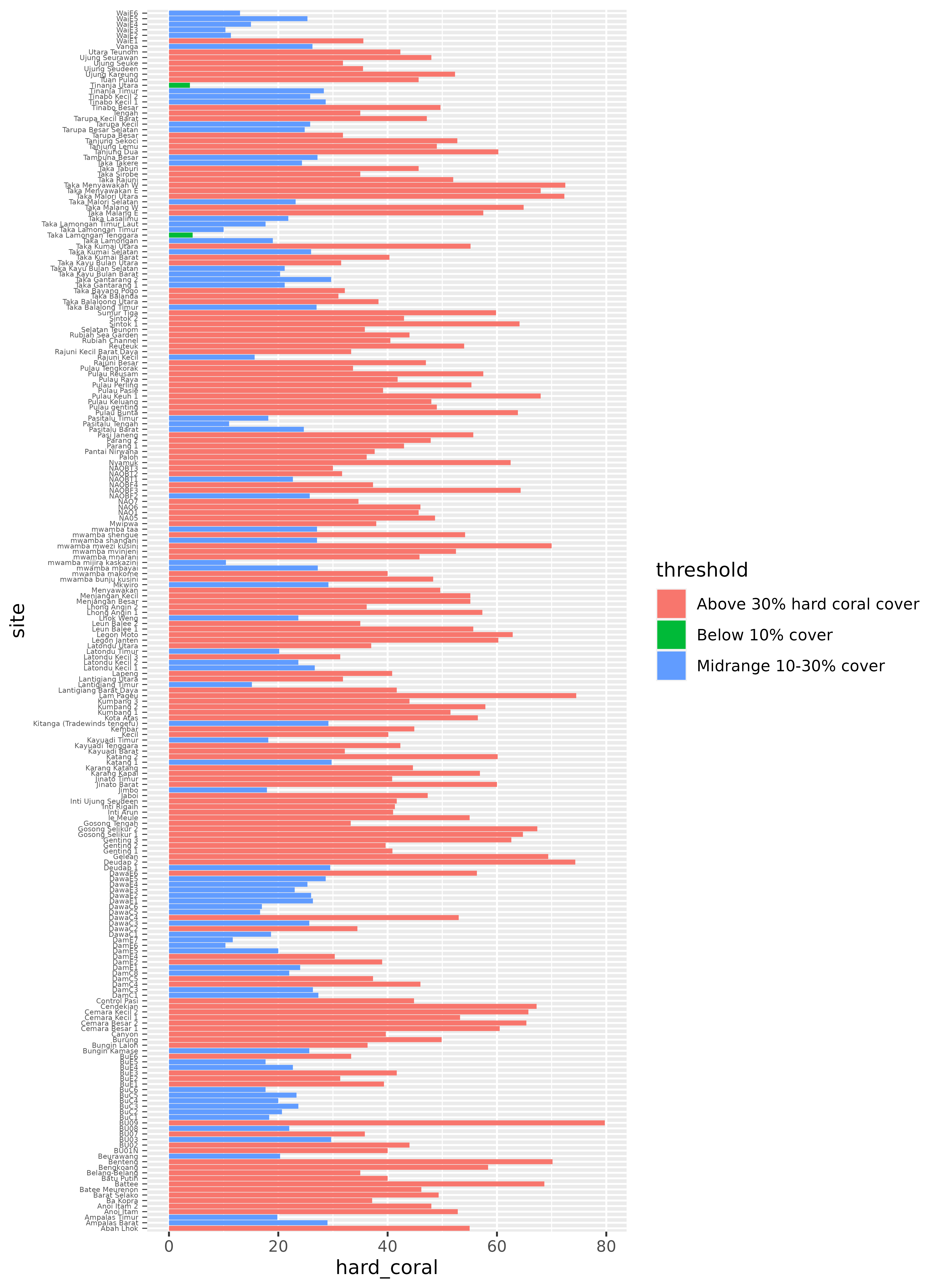
This is a good start, but it would probably be much more useful with a few changes. We can recorder the sites so that they go in descending order, from highest to lowest hard coral coverage. We can also rearrange the threshold legend, so that it follows a logical order, from highest to lowest coverage (instead of alphabetical). It would also be helpful to add a line at the 10% and 30% points, to visualize those thresholds more explicitly.
benthic_data_latest <- benthic_data_latest %>%
  mutate(
    threshold = fct_reorder(threshold, hard_coral, .desc = TRUE),
    site = fct_reorder(site, hard_coral)
  )

hard_coral_plot <- ggplot(benthic_data_latest) +
  geom_col(aes(x = hard_coral, y = site, fill = threshold), alpha = 0.8) +
  geom_vline(xintercept = 10, linetype = "dashed", linewidth = 0.25) +
  geom_vline(xintercept = 30, linetype = "dashed", linewidth = 0.25)

hard_coral_plot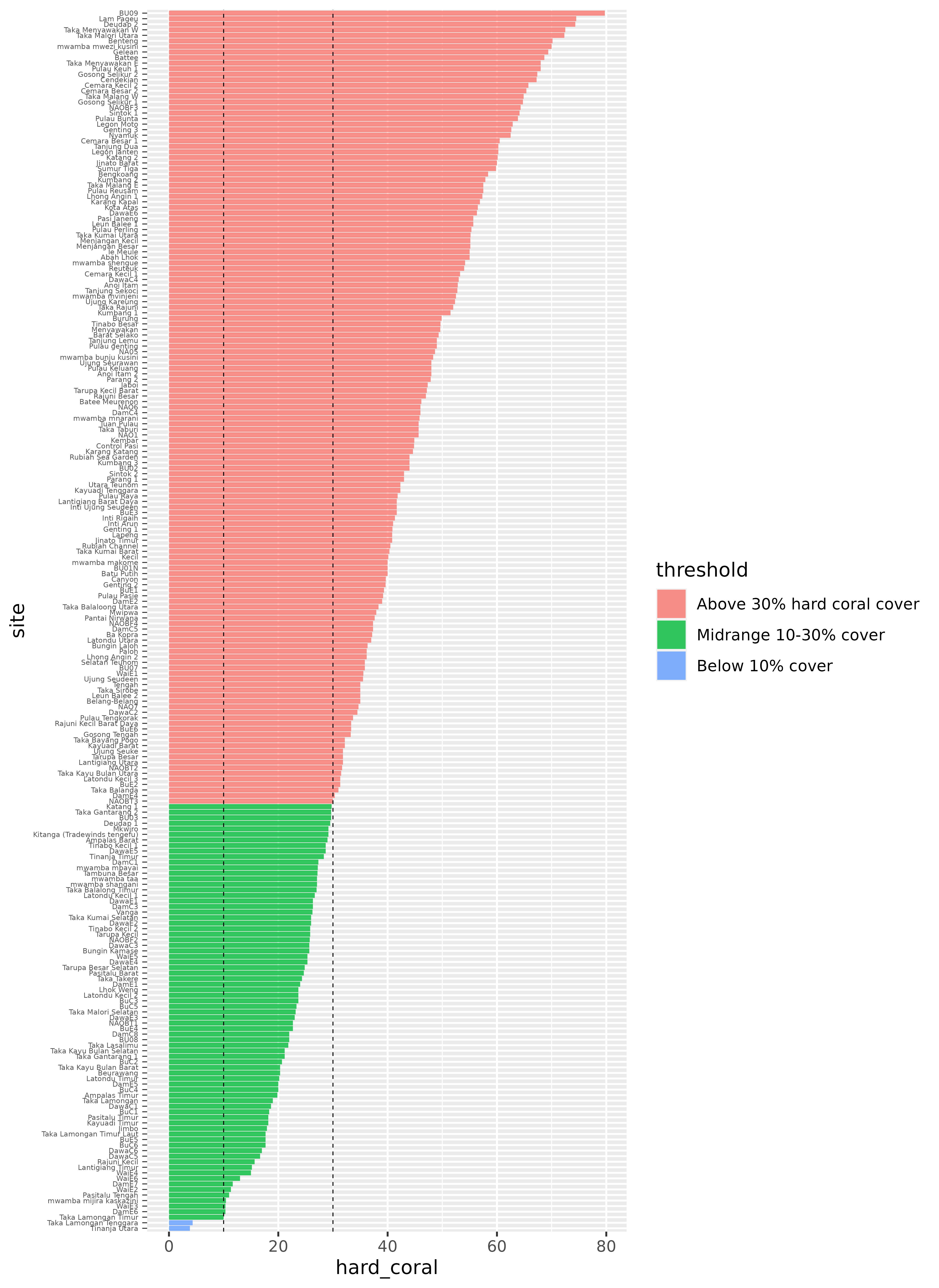
Finally, we can make some visual changes, like updating the theme, removing the site names; we care more about the distribution than which site they correspond to (which is too small to read anyways!) for this plot, adding axis labels for every 10%, cleaning up labels, and some other fiddly bits to create a beautiful plot!
hard_coral_plot <- hard_coral_plot +
  scale_x_continuous(name = "Hard coral cover, %", breaks = seq(0, 80, 10)) +
  scale_y_discrete(name = NULL) +
  scale_fill_manual(name = "Threshold", values = c("#7F7F7F", "#F1A83B", "#E73F25")) +
  labs(title = "A sample of WCS Vibrant Oceans survey sites, ordered by hard coral cover") +
  theme_minimal() +
  theme(
    axis.text.y = element_blank(),
    panel.grid.minor = element_blank(),
    panel.grid.major.y = element_blank()
  )

hard_coral_plot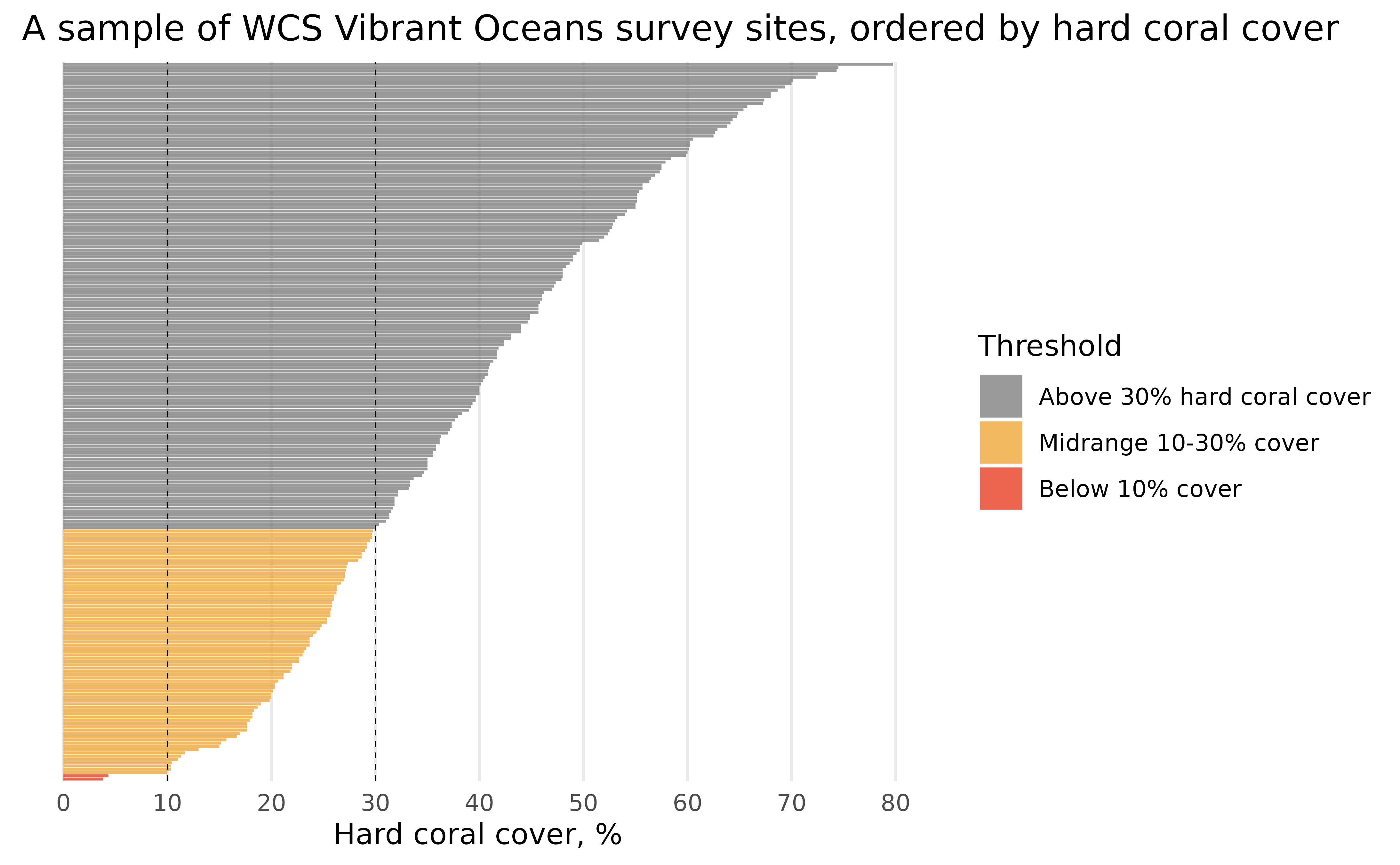
That looks much better!
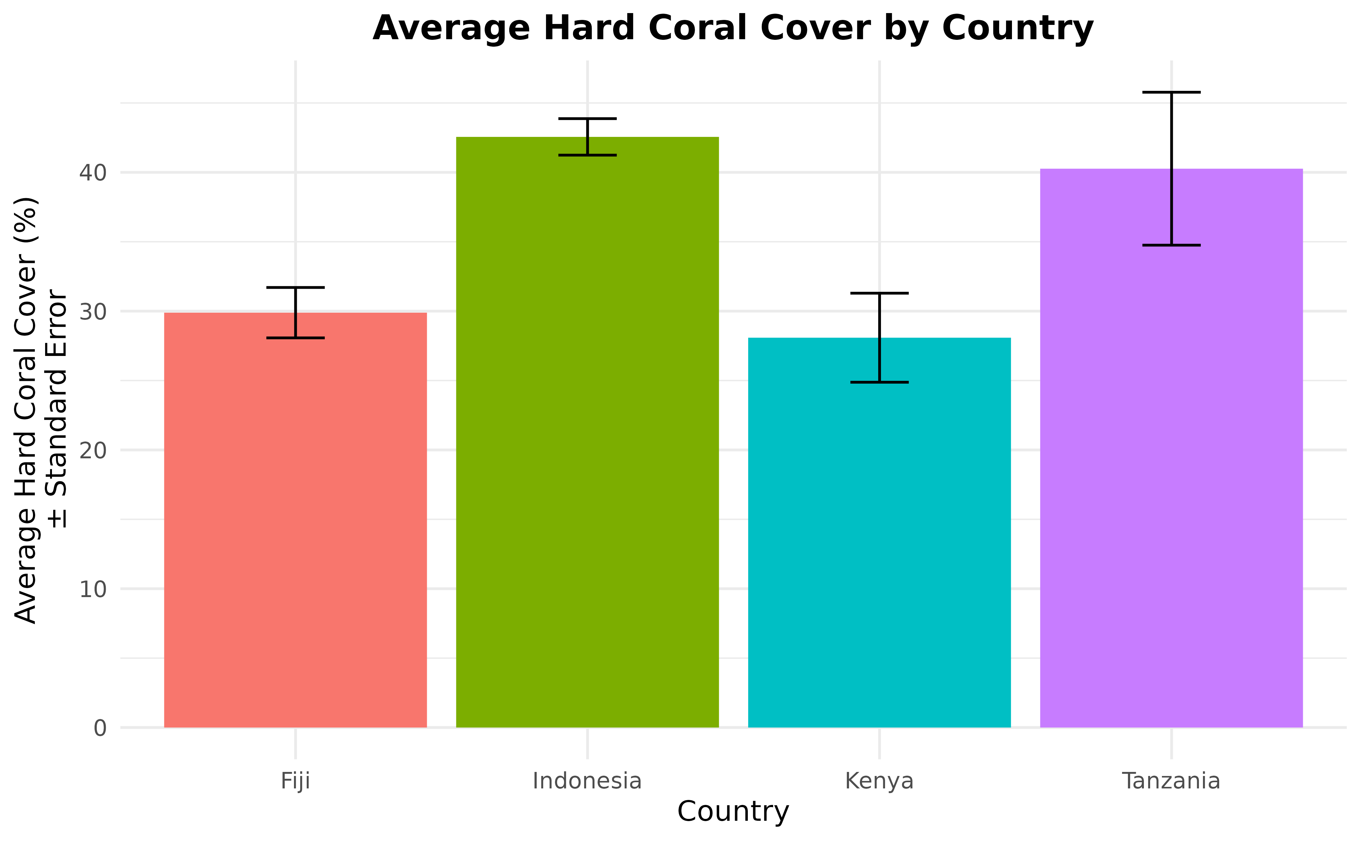
For further analysis, we can also calculate the average hard coral cover (and its standard error) then show them in a beautiful graph. Since the highest level in the data after site is country, in this example, we will calculate the average hard coral cover per country and treat sites as the replicates per country.
hard_coral_by_country <- benthic_data_latest %>%
  group_by(country) %>%
  summarise(
    n_sites = n_distinct(site),
    hard_coral_average = mean(hard_coral),
    hard_coral_sd = sd(hard_coral),
    hard_coral_se = hard_coral_sd / sqrt(n_sites)
  )

hard_coral_by_country
#> # A tibble: 4 × 5
#>   country   n_sites hard_coral_average hard_coral_sd hard_coral_se
#>   <chr>       <int>              <dbl>         <dbl>         <dbl>
#> 1 Fiji           57               29.9         13.7           1.82
#> 2 Indonesia      53               40.3         12.1           1.66
#> 3 Kenya           5               28.1          7.17          3.21
#> 4 Tanzania       10               40.3         17.4           5.51
Take a look at the hard_coral_by_country data frame.
There are only five columns with four rows of data.
You can also use the code to calculate the average hard coral cover
percentage based on other columns. For example, if you want to average
per management regime, you can group by management
instead:
benthic_data_latest %>%
  group_by(management) %>%
  summarise(
    n_sites = n_distinct(site),
    hard_coral_average = mean(hard_coral),
    hard_coral_sd = sd(hard_coral),
    hard_coral_se = hard_coral_sd / sqrt(n_sites)
  )
#> # A tibble: 30 × 5
#>    management             n_sites hard_coral_average hard_coral_sd hard_coral_se
#>    <chr>                    <int>              <dbl>         <dbl>         <dbl>
#>  1 Bu_LMMA                      4               21.8          7.73          3.86
#>  2 Control                      3               34.4          7.87          4.55
#>  3 Core Zone                   10               35.7         11.1           3.50
#>  4 Core Zone - East Coast       2               50.9         15.7          11.1
#>  5 Dama_LMMA                    8               23.1          9.47          3.35
#>  6 Dama_Tabu                    3               36.6          9.86          5.69
#>  7 Dawa_LMMA                   12               29.3         12.9           3.72
#>  8 Diani Marine Reserve         1               29.2         NA            NA
#>  9 Fisheries                    4               46.6          4.85          2.43
#> 10 Fisheries Zone - East…       4               46.6          4.85          2.43
#> # ℹ 20 more rows
You can also calculate the average and standard error for other benthic attribute, such as soft coral, macroalgae, etc.
Now that we’ve calculated the average hard coral cover and standard
error, the next step is to put the result in a nice graph. We will do
this using the ggplot2 as we did it previously, using
geom_col() to create the bars and
geom_errorbar() to show the standard errors.
ggplot(hard_coral_by_country, aes(x = country, y = hard_coral_average)) +
  geom_col(aes(fill = country)) +
  geom_errorbar(
    aes(
      x = country, y = hard_coral_average,
      ymin = hard_coral_average - hard_coral_se,
      ymax = hard_coral_average + hard_coral_se
    ),
    width = 0.2
  ) +
  labs(
    x = "Country", y = "Average Hard Coral Cover (%)\n\u00B1 Standard Error",
    title = "Average Hard Coral Cover by Country"
  ) +
  theme_minimal() +
  theme(
    legend.position = "none",
    plot.title = element_text(hjust = 0.5, face = "bold")
  )
It might also be interesting to see the changes in hard coral cover
over time. To make this graph, first, we need to go back to the original
benthic_data data set which contains sample date.
benthic_data <- benthic_data %>%
  select(country, site, sample_date, hard_coral = percent_cover_benthic_category_avg_hard_coral)
The next step is to separate it into year, month, and day. To do
this, we’re going to use the separate() function.
benthic_data <- benthic_data %>%
  separate(sample_date,
    into = c("year", "month", "day"),
    sep = "-"
  )

benthic_data
#> # A tibble: 173 × 6
#>    country site   year  month day   hard_coral
#>    <chr>   <chr>  <chr> <chr> <chr>      <dbl>
#>  1 Fiji    DawaC1 2019  10    17         15.3
#>  2 Fiji    DawaE5 2019  10    15         12
#>  3 Fiji    BuC3   2019  10    08         17
#>  4 Fiji    DamE6  2019  11    12          5.67
#>  5 Fiji    DawaC5 2019  10    16          7.33
#>  6 Fiji    BuE6   2019  10    09         33.3
#>  7 Fiji    BuE1   2019  10    09         15.3
#>  8 Fiji    BuC1   2019  10    11         18.3
#>  9 Fiji    WaiE5  2019  10    14         10
#> 10 Fiji    DawaC2 2019  10    14          0.67
#> # ℹ 163 more rows
Now we have all of the columns that we need, we can continue by calculating the average hard coral cover by year by country.
hard_coral_by_country_by_year <- benthic_data %>%
  group_by(country, year) %>%
  summarise(hard_coral_average = mean(hard_coral)) %>%
  ungroup()

hard_coral_by_country_by_year
#> # A tibble: 6 × 3
#>   country   year  hard_coral_average
#>   <chr>     <chr>              <dbl>
#> 1 Fiji      2019                22.1
#> 2 Fiji      2022                30.9
#> 3 Indonesia 2022                48.9
#> 4 Indonesia 2024                35.0
#> 5 Kenya     2020                28.1
#> 6 Tanzania  2020                40.7
In the hard_coral_by_country_by_year data frame, you can
see that only Fiji and Indonesia have more
than one year data. So, we’re going to remove countries that only have
one year of data.
hard_coral_by_country_by_year <- hard_coral_by_country_by_year %>%
  group_by(country) %>%
  mutate(n_years = n_distinct(year)) %>%
  filter(n_years > 1) %>%
  ungroup() %>%
  select(-n_years)
Now, we are ready to present the data in a line plot.
ggplot(
  hard_coral_by_country_by_year,
  aes(x = year, y = hard_coral_average, group = country, color = country)
) +
  geom_line() +
  geom_point() +
  labs(
    x = "Year", y = "Average Hard Coral Cover (%)",
    title = "Trend of Average Hard Coral Cover by Country"
  ) +
  scale_color_discrete(name = "Country") +
  theme_minimal() +
  theme(plot.title = element_text(hjust = 0.5, face = "bold"))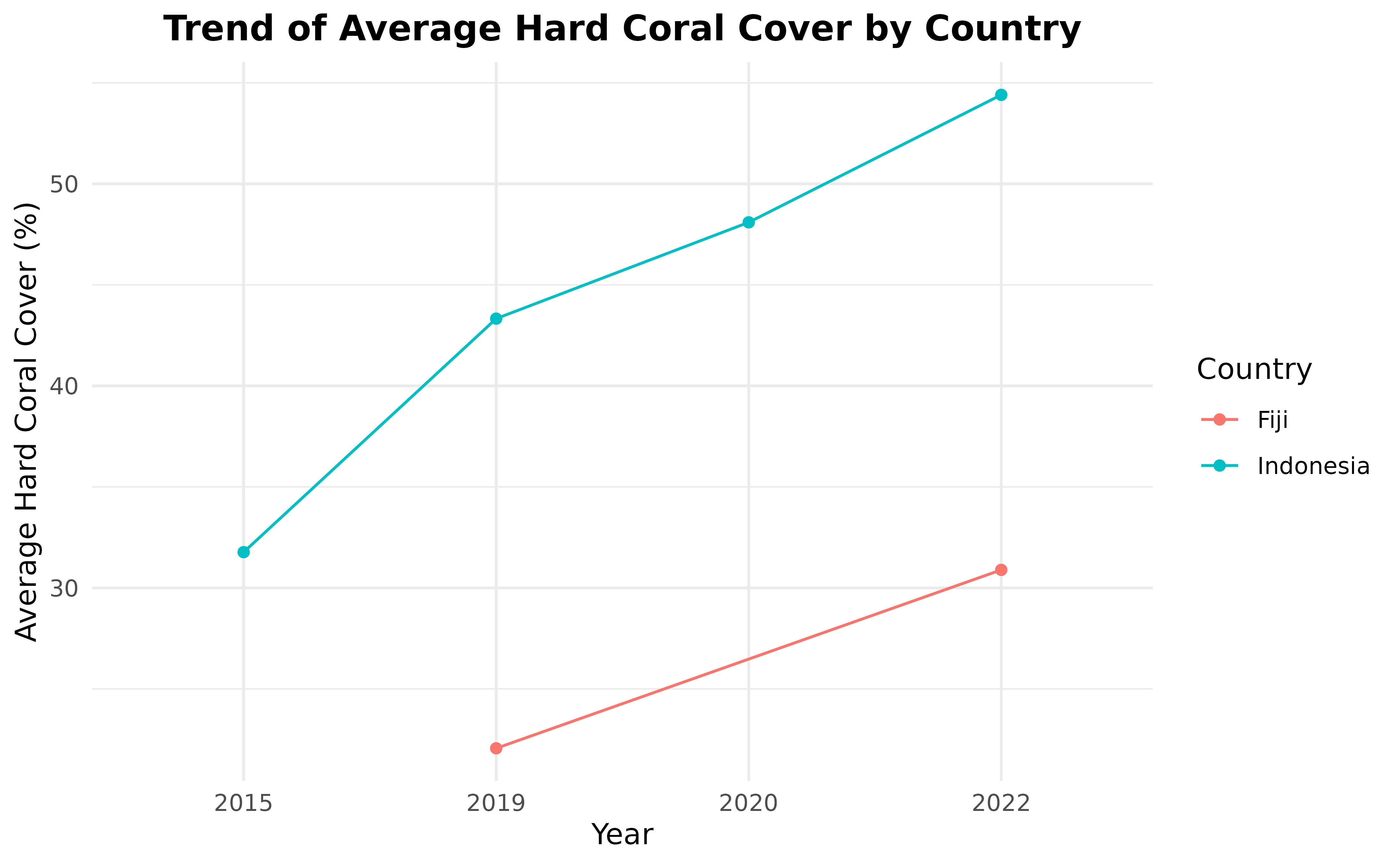
Looks great! You can save the plot and use it in your report!
Reef fish biomass
Next, let’s turn to reef fish biomass. Similarly to the step above, we can get this data by filtering for projects that have publicly available summary data for it.
projects_public_fishbelt <- vo_projects %>%
  filter(data_policy_beltfish == "Public Summary")

projects_public_fishbelt %>%
  select(name)
#> # A tibble: 9 × 1
#>   name
#>   <chr>
#> 1 2022_BAF and WISH coral reef surveys in Tailevu_Ovalau
#> 2 2022 DamaWISH endline survey
#> 3 Aceh East Coast 2019
#> 4 ACEH_EAST COAST_2022
#> 5 Aceh Jaya MPA 2022
#> 6 Pulau Weh 2022
#> 7 Taka Bonerate NP-2024
#> 8 VOI - 2019
#> 9 VOI - 20/22
Next, we query for public summary data, again using
mermaid_get_project_data to get “sampleevents” data, this
time specifying the “fishbelt” method:
fishbelt_data <- projects_public_fishbelt %>%
  mermaid_get_project_data("fishbelt", "sampleevents", token = NULL)

head(fishbelt_data)
#> # A tibble: 6 × 150
#>   project             tags  country site  latitude longitude reef_type reef_zone
#>   <chr>               <chr> <chr>   <chr>    <dbl>     <dbl> <chr>     <chr>
#> 1 2022_BAF and WISH … WCS … Fiji    WaiE4    -17.8      179. fringing  fore reef
#> 2 2022_BAF and WISH … WCS … Fiji    NAOB…    -17.6      179. fringing  fore reef
#> 3 2022_BAF and WISH … WCS … Fiji    BU03     -17.7      179. fringing  back reef
#> 4 2022_BAF and WISH … WCS … Fiji    NAOB…    -17.6      179. fringing  fore reef
#> 5 2022_BAF and WISH … WCS … Fiji    NAOB…    -17.6      179. fringing  fore reef
#> 6 2022_BAF and WISH … WCS … Fiji    NAOB…    -17.6      179. fringing  back reef
#> # ℹ 142 more variables: reef_exposure <chr>, tide <chr>, current <chr>,
#> #   visibility <chr>, management <chr>, management_secondary <chr>,
#> #   management_est_year <dbl>, management_size <dbl>, management_parties <chr>,
#> #   management_compliance <chr>, management_rules <chr>, sample_date <date>,
#> #   depth_avg <dbl>, depth_sd <dbl>, biomass_kgha_avg <dbl>,
#> #   biomass_kgha_sd <dbl>, biomass_kgha_trophic_group_avg_omnivore <dbl>,
#> #   biomass_kgha_trophic_group_avg_piscivore <dbl>, …
Again, this summarises all observations for all transects at a given site and date, and gives us information like the average biomass at that site, and average biomass across groupings like trophic group or fish family.
We’ll just focus on the average biomass, at the latest sample date for each site:
fishbelt_data_latest <- fishbelt_data %>%
group_by(site) %>%
filter(sample_date == max(sample_date)) %>%
ungroup() %>%
select(country, site, biomass = biomass_kgha_avg) %>%
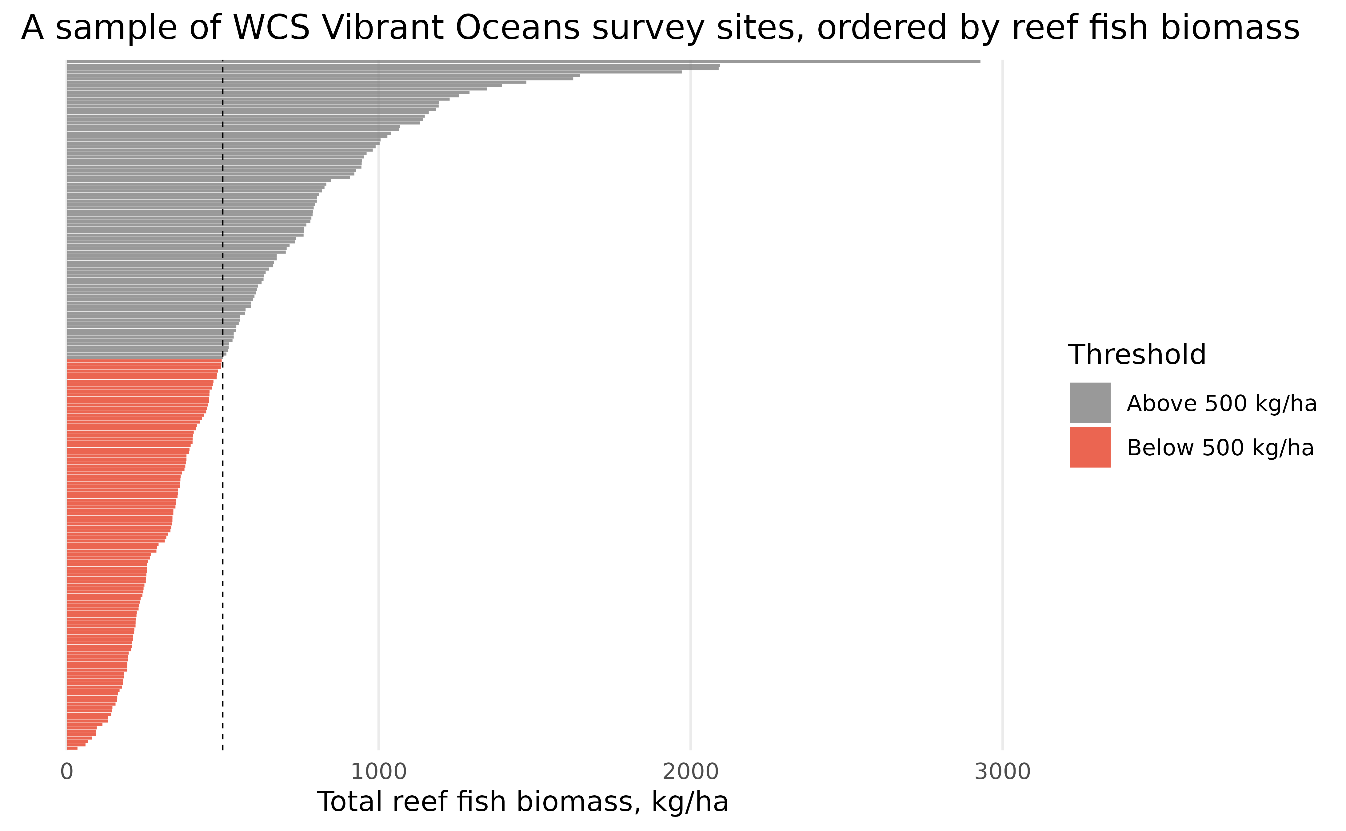
distinct()WCS considers 500 kg/ha as a threshold where below this biomass,
ecosystems may pass critical thresholds of ecosystem decline, and often
seek to maintain reef fish biomass above 500 kg/ha as a management
target. Let’s categorize each value of biomass according to
whether it’s above or below 500 kg/ha, and reorder both the sites and
the threshold factor from highest to lowest biomass:
fishbelt_data_latest <- fishbelt_data_latest %>%
  mutate(
    threshold = case_when(
      biomass >= 500 ~ "Above 500 kg/ha",
      biomass < 500 ~ "Below 500 kg/ha"
    ),
    threshold = fct_reorder(threshold, biomass, .desc = TRUE),
    site = fct_reorder(site, biomass)
  )
Then, we can visualize the distribution of average biomass in sites, similar to our visualization before:
ggplot(fishbelt_data_latest) +
  geom_col(aes(x = biomass, y = site, fill = threshold), alpha = 0.8) +
  geom_vline(xintercept = 500, linetype = "dashed", size = 0.25) +
  scale_x_continuous(name = "Total reef fish biomass, kg/ha") +
  scale_y_discrete(name = NULL) +
  scale_fill_manual(name = "Threshold", values = c("#7F7F7F", "#E73F25")) +
  labs(title = "A sample of WCS Vibrant Oceans survey sites, ordered by reef fish biomass") +
  theme_minimal() +
  theme(
    axis.text.y = element_blank(),
    panel.grid.minor = element_blank(),
    panel.grid.major.y = element_blank()
  )
We can also calculate the average fish biomass per country with standard errors and fish biomass trend through time, just like we did for benthic. First, let’s calculate the average fish biomass bt country and present it in a bar plot.
fish_biomass_by_country <- fishbelt_data_latest %>%
  group_by(country) %>%
  summarise(
    n_sites = n_distinct(site),
    fish_biomass_average = mean(biomass),
    fish_biomass_sd = sd(biomass),
    fish_biomass_se = fish_biomass_sd / sqrt(n_sites)
  )

fish_biomass_by_country
#> # A tibble: 3 × 5
#>   country   n_sites fish_biomass_average fish_biomass_sd fish_biomass_se
#>   <chr>       <int>                <dbl>           <dbl>           <dbl>
#> 1 Fiji           27                 842.            500.            96.1
#> 2 Indonesia      56                 421.            190.            25.4
#> 3 Tanzania       36                 238.            212.            35.4

ggplot(fish_biomass_by_country, aes(x = country, y = fish_biomass_average)) +
  geom_col(aes(fill = country)) +
  geom_errorbar(
    aes(
      x = country, y = fish_biomass_average,
      ymin = fish_biomass_average - fish_biomass_se,
      ymax = fish_biomass_average + fish_biomass_se
    ),
    width = 0.2
  ) +
  labs(
    x = "Country", y = "Average Fish Biomass (kg/ha)\n\u00B1 Standard Error",
    title = "Average Fish Biomass by Country"
  ) +
  theme_minimal() +
  theme(
    legend.position = "none",
    plot.title = element_text(hjust = 0.5, face = "bold")
  )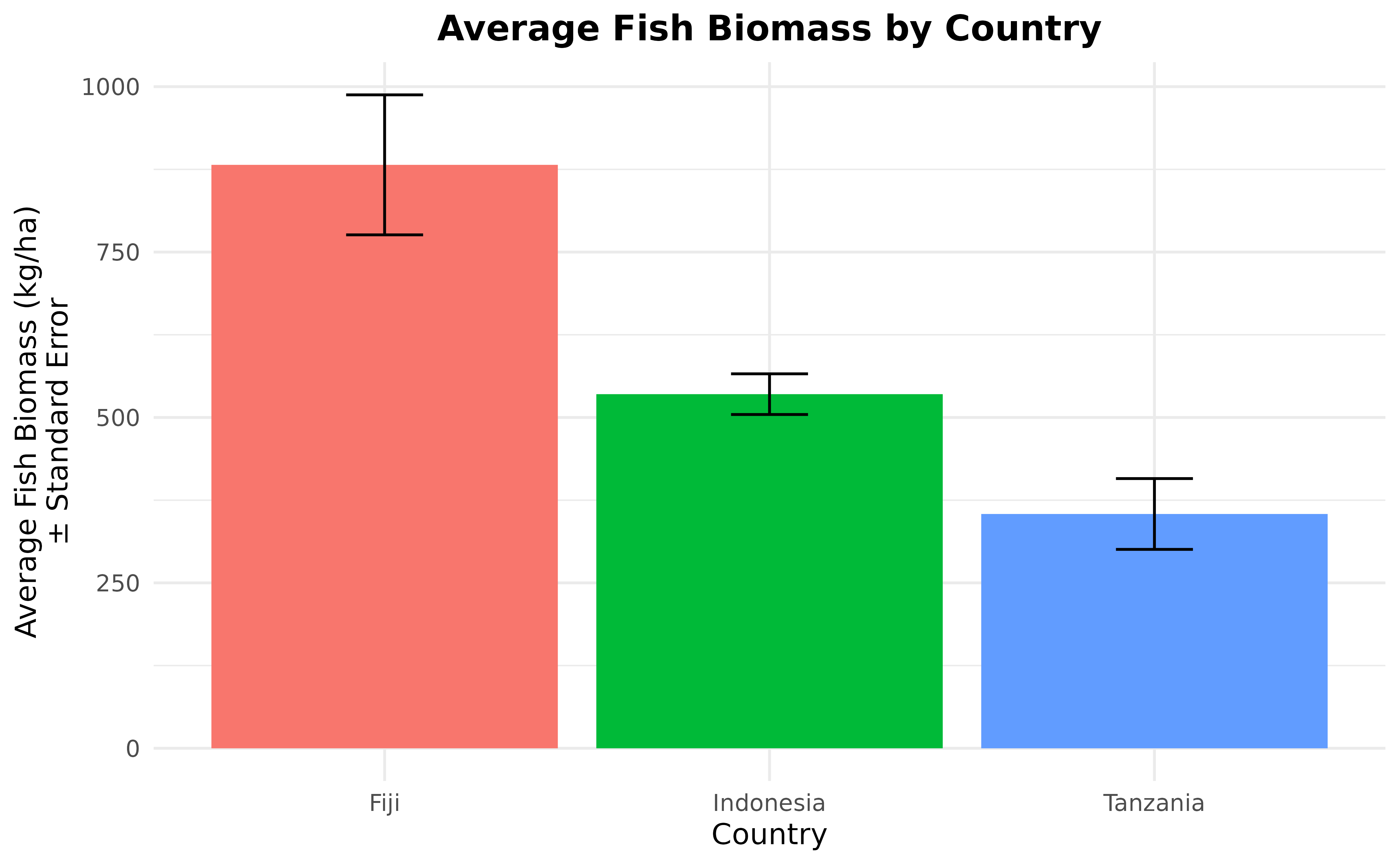
We have our average fish biomass per country plot. Let’s continue
with visualizing the changes in fish biomass per country. Again, we’ll
go back to the original fishbelt_data data set which has
the sample date.
fishbelt_data <- fishbelt_data %>%
select(country, site, sample_date, biomass = biomass_kgha_avg)
fishbelt_data <- fishbelt_data %>% separate(sample_date,
into = c("year", "month", "day"),
sep = "-"
)
fishbelt_biomass_by_country_by_year <- fishbelt_data %>%
group_by(country, year) %>%
summarise(fish_biomass_average = mean(biomass)) %>%
ungroup()
fishbelt_biomass_by_country_by_year
#> # A tibble: 7 × 3
#> country year fish_biomass_average
#> <chr> <chr> <dbl>
#> 1 Fiji 2022 842.
#> 2 Indonesia 2019 785.
#> 3 Indonesia 2022 514.
#> 4 Indonesia 2024 363.
#> 5 Tanzania 2019 330.
#> 6 Tanzania 2022 348.
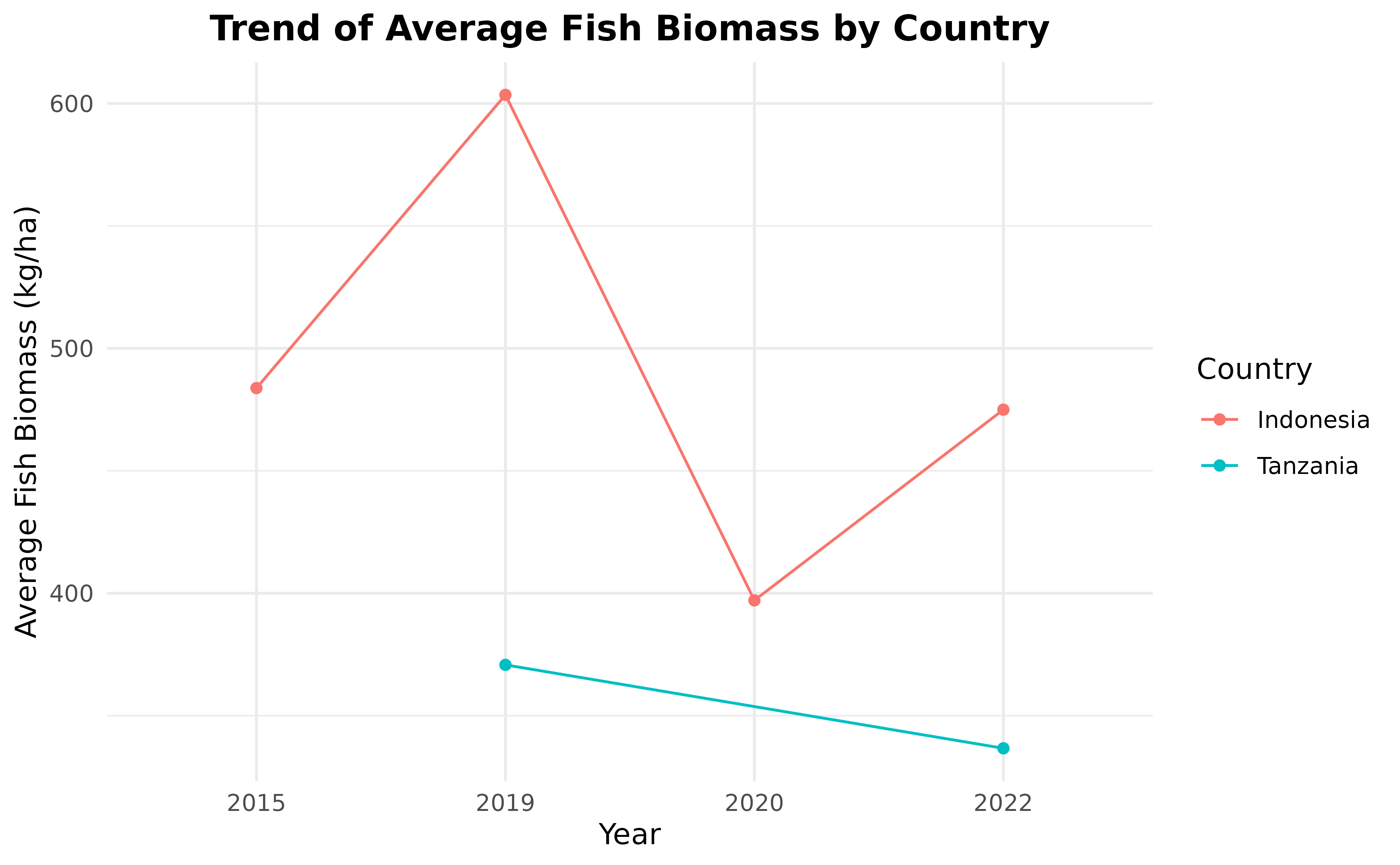
#> 7 Tanzania 2023 70.6Looking at the fishbelt_biomass_by_country_by_year data
frame, we can see that there are only two countries that have more than
one year of fish data, which are Indonesia and Tanzania. So, we are
going to only use data from countries with more than one year of data,
then visualize it in a line plot.
fishbelt_biomass_by_country_by_year <- fishbelt_biomass_by_country_by_year %>%
  group_by(country) %>%
  mutate(n_years = n_distinct(year)) %>%
  filter(n_years > 1) %>%
  ungroup() %>%
  select(-n_years)

ggplot(
  fishbelt_biomass_by_country_by_year,
  aes(x = year, y = fish_biomass_average, group = country, color = country)
) +
  geom_line() +
  geom_point() +
  labs(
    x = "Year", y = "Average Fish Biomass (kg/ha)",
    title = "Trend of Average Fish Biomass by Country"
  ) +
  scale_color_discrete(name = "Country") +
  theme_minimal() +
  theme(plot.title = element_text(hjust = 0.5, face = "bold"))